Hospitality / Nelson
Cantina Nicola
Cilantro, chilli, and the perfect fold of a tortilla. A December launch that needed to look as good as it tasted.
INSIDE THE PROJECT
-
Launching in the height of a New Zealand summer, Cantina Nicola needed a visual system that captured the energy of its brand from day one. The challenge was to translate elevated street food into a digital presence that felt bold, vibrant, and appetite-inducing. Something people could not just see, but almost taste through their screens.
-
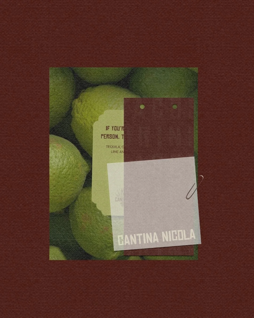
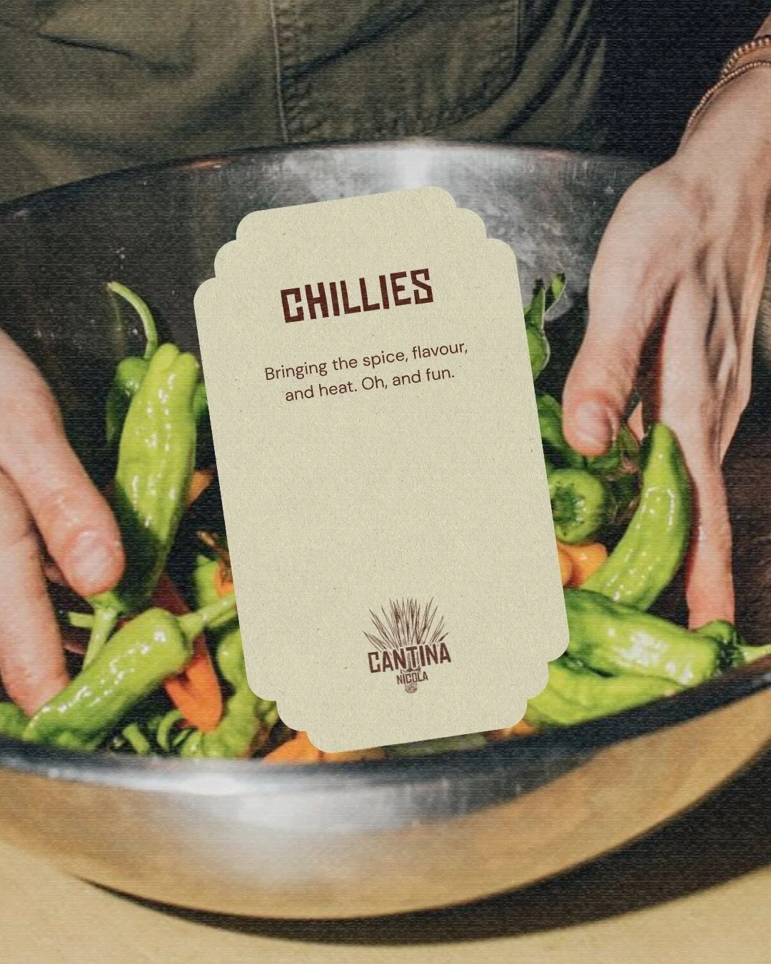
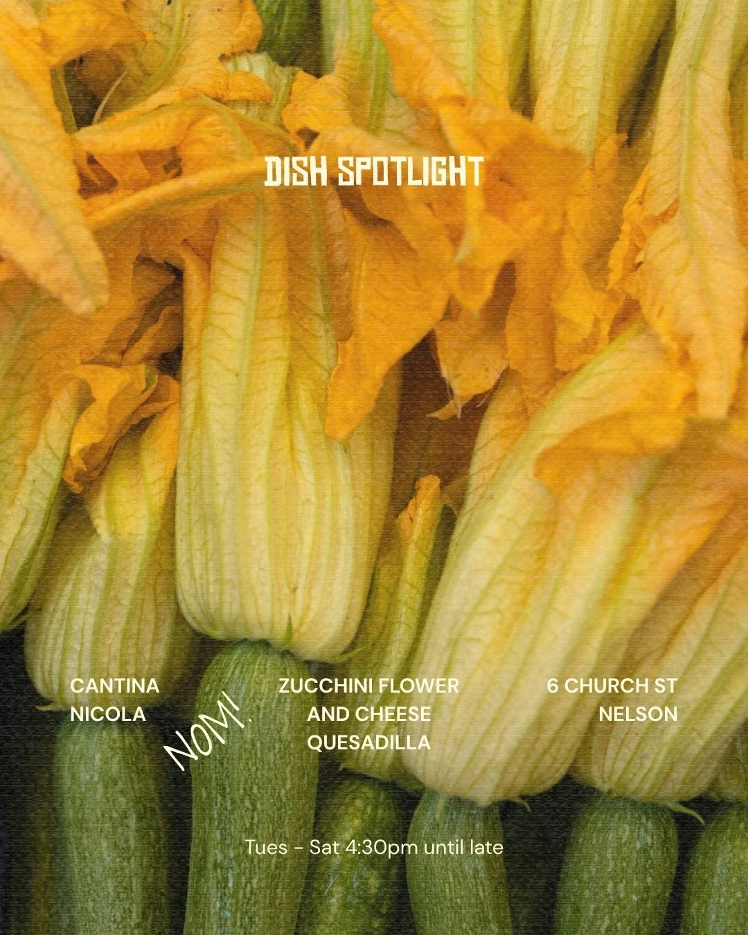
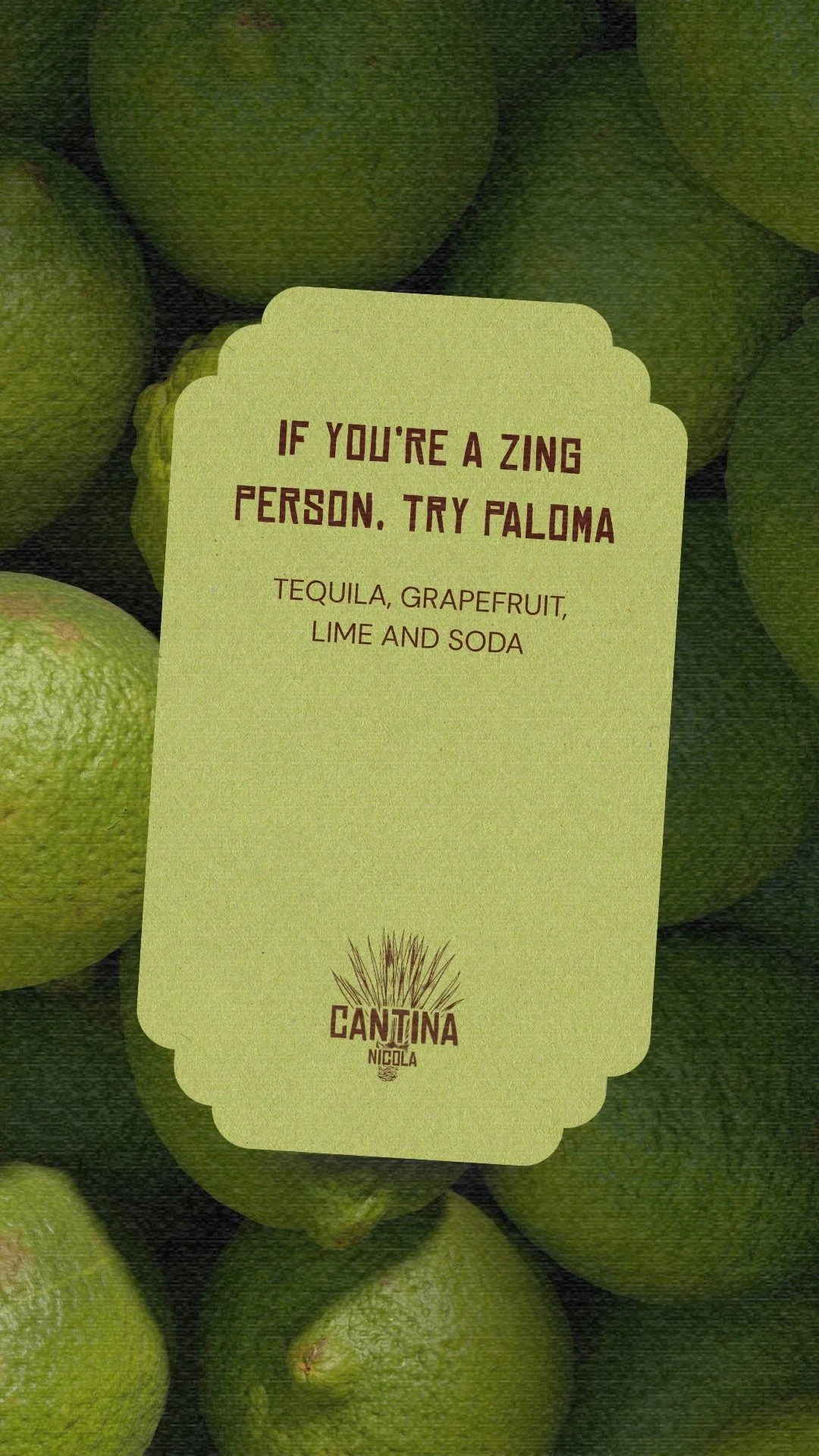
We created a Template Library built around three core pillars: flavour, colour, and texture. Each design was crafted to feel like an invitation to the table, combining poster-inspired layouts with layered compositions, vibrant tones, and rich visual storytelling. From margaritas in evening light to lime, chilli, tiles, and the perfect fold of a tortilla, every element was curated to capture the essence of modern street food.
-
The final system gave Cantina Nicola a scalable, high-impact content foundation that balanced consistency with personality.
Creative Direction & Visual Strategy
Canva Templates (Feed & Stories)
Instagram Feed Mockup
In-File Usage Notes
Curated Imagery Library
Notion Content Hub


THE SYSTEM
01
Bold typography. Layered colour. Designed to command attention in-feed. Every post built to stop the scroll.
Poster Energy
02
Templates were designed around what made the menu unforgettable. The product remained the hero, amplifying flavour and atmosphere.
Ingredient-Led
Flexible yet consistent, the system allowed Cantina Nicola to show up with confidence across touchpoints.
Flexible Templates
03
SELECTED CLIENTS
Hospitality
Hospitality
Wellness
Connings Food Market
Specialty Food